Shorts Thumbnail Design: Make Covers That Work in a Grid
The thing most guides miss: a Shorts cover is almost never seen on its own. It's seen as one tile in a grid of your own covers on your channel's Shorts tab. That means your cover doesn't compete with strangers — it competes with your other covers, and the whole set is judged at once. Every rule below follows from that.
Advice for 16:9 thumbnails gets recycled for Shorts with the dimensions swapped, and it doesn't transfer. A regular thumbnail appears in a feed surrounded by other channels, where the job is to stand out. A Shorts cover mostly appears surrounded by you, where the job is to look like a channel worth following.
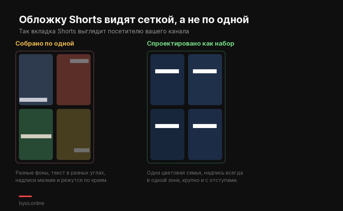
1Design the set, not the cover
This is the rule that changes results, and it's the one that feels wrong at first, because it asks you to make each individual cover less distinctive.
Pick one colour family, one text position, one typeface, and hold them across everything you publish. A visitor scrolling your Shorts tab should register a channel with a look, not a pile of unrelated images. The tiles that break the system stand out — but as mistakes, not as highlights.
The practical version: build one template, then only change what's inside it.
Cheap test: open your channel's Shorts tab in a private window. That's what a stranger sees before deciding to subscribe. If your covers look like four people made them, they did — you, on four different evenings.
2Vary the subject inside the system
Consistency has an obvious failure mode: if every cover is identical, the grid becomes wallpaper and nobody can tell your videos apart.
So hold the frame constant and change the content. Same colour and same text placement, different subject, different photo, different two words. The visitor should read the set as one channel and each tile as a distinct video, in that order.
3Two or three words, and no more
In a grid, each cover gets a fraction of the screen width. On a phone that's a tile roughly the size of a business card, and the text inside it is smaller still.
A full sentence at that size is a texture, not a message. Two or three words survive; five don't. If you can't read your own cover text when the image is scaled down to thumbnail size, it isn't communicating — it's decoration.
Practical numbers we use: text large enough that it stays legible when the whole cover is a couple of centimetres tall, and real padding around it, because edges get cropped differently on different surfaces.
4Size and safe zone
| Parameter | Value |
|---|---|
| Aspect ratio | 9:16 (vertical) |
| Resolution | 1080×1920 |
| Keep important content | in the central area, away from all four edges |
A horizontal 1280×720 image dropped into a vertical slot gets cropped or padded — that mismatch is the single most common reason a Shorts cover looks broken. Full sizing details are in our Shorts thumbnail size guide.
On the safe zone: different surfaces trim the frame differently, and YouTube doesn't publish an exact safe-area spec for Shorts covers. Treat generous margins as insurance rather than as a documented rule — anything pushed to an edge is the first thing you risk losing.
5The cover and the first frame are different jobs
These get conflated constantly, including by people who set the cover by picking a frame.
- The cover sells the video to someone browsing your channel or a search result. It can be posed, captioned, deliberately composed.
- The first frame has to hold someone who is already watching and whose thumb is moving. It needs motion and immediacy.
A great cover often makes a weak opening second, and vice versa. If you can upload a custom image, you get to optimise both separately — which is the real reason the July 2026 change matters. If uploads haven't reached your channel yet, the frame trick in our main Shorts guide gets you a designed cover today.
6Remember where covers actually appear
Worth repeating because it decides how much effort this deserves: the cover never shows in the swipeable Shorts feed. That feed plays video instantly.
YouTube names the surfaces where it does appear: search results, hashtag and audio pivot pages, and your channel page. In practice you'll also see covers on the Shorts shelf on the homepage.
All of those are browsing moments. None of them are the feed. So covers won't rescue a Short that isn't landing — and they will absolutely shape whether someone who arrived on your channel decides to stay. If yours aren't showing up at all, that's a different problem, covered in Shorts thumbnail not showing.
The checklist
- Built from a template shared with the rest of your Shorts
- Subject clearly different from the neighbouring tiles
- Two or three words, readable when tiny
- 1080×1920, nothing important near the edges
- Checked on your own channel's Shorts tab, not in your design tool
- Not the same image as your opening frame
Need a vertical cover and nothing to draw it in? BYSO generates 9:16 covers from a text description — add your own photo, pick a style, and you have a set with a consistent look.
Generate a cover →FAQ
What size should a Shorts thumbnail be?
Vertical 9:16 — 1080×1920. A horizontal 1280×720 image will be cropped or padded in a vertical slot.
How much text should it have?
Two or three words. Covers are shown small in a grid, and a sentence at that size becomes a smudge.
Should all my covers look the same?
They should share a system, not be identical. Same colours, same text position, different subject per video.
Does the cover appear in the Shorts feed?
No — that feed plays video immediately. Covers appear in search, on hashtag and audio pages and on your channel page.
Is the cover the same as the first frame?
Different jobs. The cover sells to a browser; the first frame holds a viewer already watching. Optimise them separately.
Next: see how a cover holds up before you publish it — our free thumbnail preview tool has a vertical mode that puts your image on the real Shorts surfaces.